Exploring the Enchanting Palette of Scandinavian Colors
Introduction
Scandinavian design has a distinct aesthetic that is often credited with simplicity, minimalism, and functionality. However, its color palette also plays a significant role in creating this unique style. The colors used in Scandinavian design are often soft, muted, and soothing. They are influenced by the natural environment and the changing seasons. In this article, we will explore the enchanting palette of Scandinavian colors and how they contribute to the style.
The Colors
The color palette of Scandinavian design is characterized by cool, pale, and subtle tones. The most commonly used colors are:
White
White is the primary color of Scandinavian design. Its purity, simplicity, and luminance create an uncluttered and tranquil environment. It also reflects the natural light, which is scarce during the winter months in Scandinavian countries.
Gray
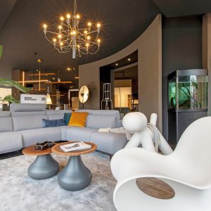
Gray is another popular color in Scandinavian design. It ranges from light to dark shades and is used to create a sense of calm and elegance. It also helps to accentuate other colors used in the design.
Blue
Blue is a significant color in Scandinavian design, as it reflects the region’s close relationship with the sea. It is often used in light, soothing shades to evoke a sense of calmness and serenity.
Green
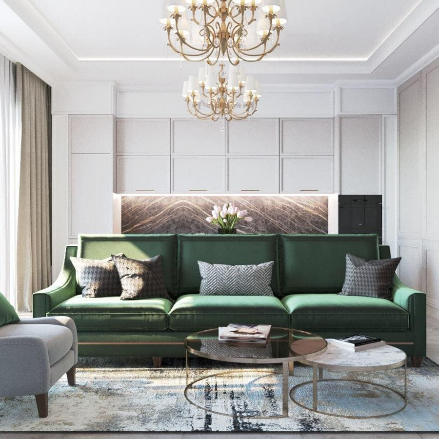
Green is another color that is often used in Scandinavian design. It represents nature and is used to create a connection with the outdoors. The shades range from soft, sage greens to more intense, vivid greens.
Neutral Colors
Neutral colors like beige, taupe, and cream are also commonly used in Scandinavian design. They add warmth and texture to the design, creating a cozy atmosphere.
The Role of Colors in Scandinavian Design
The colors used in Scandinavian design play a crucial role in creating a unique and recognizable style. The soft, muted colors create an atmosphere of tranquility and relaxation, which is essential in a region where the winters are long and dark. The colors also reflect the natural environment, celebrating the beauty of the changing seasons.
Creating Contrast
The colors used in Scandinavian design are often used in contrast with one another. The white walls and furniture are often contrasted with warmer wood tones and black accents. This contrast creates interest and adds depth to the design.
Creating Harmony
The colors used in Scandinavian design are carefully chosen to create a harmonious environment. They are often used in monochromatic schemes, with subtle variations in tone and texture. This creates a cohesive and calming atmosphere.